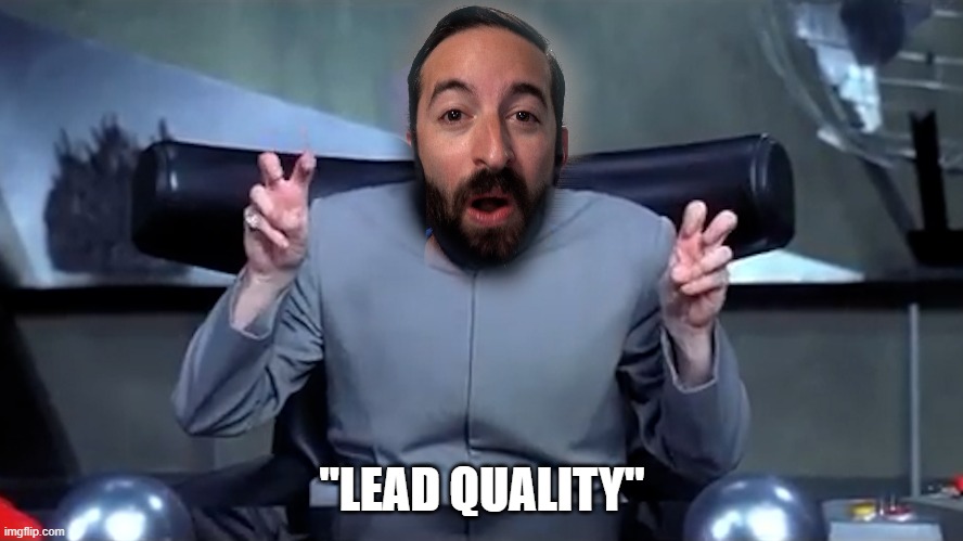
If you’re driving quality traffic to high-intent pages, your lead form may be the problem. Picture Deebo from the movie Friday uppercutting your prospect, preventing them from advancing. Then, Chris Tucker stands over your prospect and declares, “You got—a bad user experience!”

But there’s good news.
Simple fixes can have a big impact.
User experience is the name of the game.
If a potential customer wants to take action, make it easy. HubSpot found that removing one form field can increase conversions by 27%, including dropdowns.
You might think the more a prospect works to reach you, the more “qualified” they are. (I’m picturing Dr. Evil from Austin Powers doing his finger air-quote gesture here.) But is this really how we want to operate? Do we want to make our best potential customers jump through hoops? Let’s not be the automated phone system of lead forms.

Prospects are busy. They don’t have time for lengthy, cumbersome forms. Each second they spend on a complicated form is a second they’re reconsidering whether it’s worth their effort. Frustrated prospects abandon forms, a clear sign something needs to change.
Check out the followup to this post: 6 Easy Steps I used to improve lead form conversion rates by 33%.
Let’s fix your forms!
Subscribe to my blog below and stay tuned for my next post:
