Check out my video above! I had fun illustrating the importance of good user experience, but—brace yourself—the opening clip was deemed too real for LinkedIn.
The bottom line: when your boss demands leads now, it’s easy to get drawn into “quick-fix” marketing tactics. But if you’re not careful, this will turn off your audience, sending them running for the hills. Like Indiana Jones escaping with the stolen idol in Raiders of the Lost Ark.
Instead, generously cater to your prospects, making it easy for them to get exactly what they need.
This leads to happy customers and, ultimately, a boss who’s thrilled with sustainable growth.
So, I give you…
The Ultimate Guide to Creating High-Converting Landing Pages
But wait!
Before we go further, it’s important to note: every tip here can (and in some cases should) be A/B tested to see what works best for your audience.
Okay, back to it…

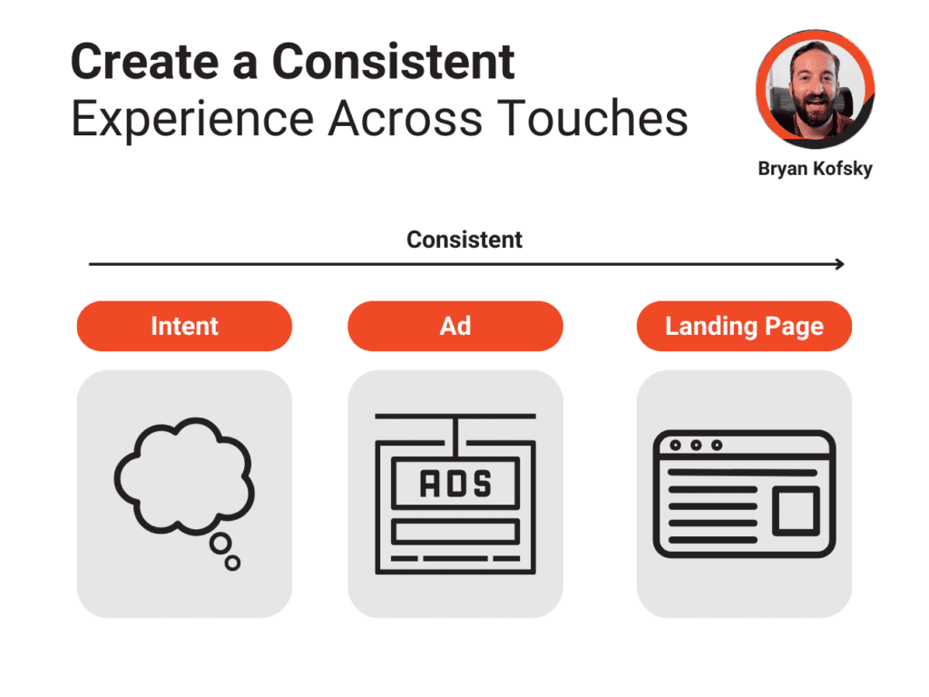
Step 1: Create a Consistent Experience
Intent → Ad → Landing Page
When a prospect lands on your page, it should feel like a seamless continuation of their journey. Align your ad copy and visuals with the landing page to reassure visitors they’re in the right place. Consistency reduces bounce rates and sets the stage for higher engagement and conversions.

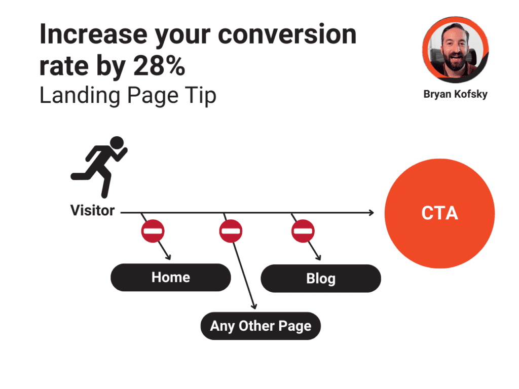
Step 2: Remove All Site Navigation
Landing pages should be distraction-free, focusing on a single action. Removing navigation keeps visitors honed in on the primary action you want them to take. Whether that’s filling out a form, signing up, or making a purchase.

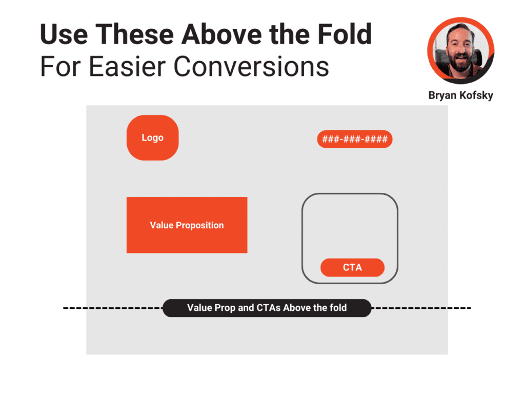
Step 3: Keep Essentials Above the Fold
Optimize the top portion of your landing page with these elements:
- Clear Value Proposition: Tell visitors why they’re here and what’s in it for them.
- Strong CTA (Call to Action): Make it easy for visitors to take the next step without scrolling.
- Contact Information: Adding a phone number or live chat option can add trust and accessibility.

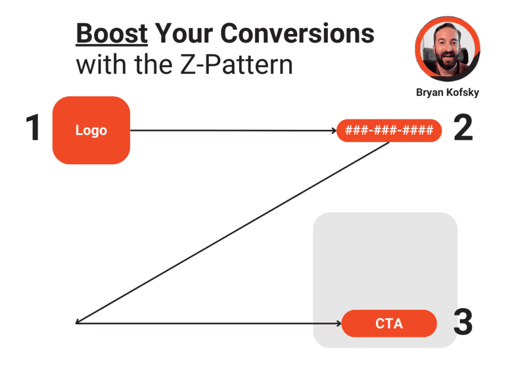
Step 4: Use the Z-Pattern Design
People naturally read in a “Z” shape, especially on webpages. Place important elements like logos, CTAs, and key information in areas where they’re likely to catch the eye. This layout leverages natural scanning habits to guide users from top-left to bottom-right across your content.
Step 5: Include Social Proof
Reviews, testimonials, and customer ratings significantly boost credibility. Studies show that 63% of consumers are more likely to engage with a page that includes social proof. Highlight positive customer experiences to build trust quickly.
Want to take your optimization even further? Check out my blog post, 6 Easy Steps to Improve Lead Form Conversion Rates by 33%. I cover more actionable insights and include a step-by-step video to guide you.
Conclusion
By following these guidelines, you’ll be creating landing pages that resonate, build trust, and drive conversions. When you focus on creating an experience that genuinely helps your prospects, the results will follow. And don’t forget to test! Your boss (and your audience) will thank you.
Want more of this stuff? Subscribe!
Get My Serious Marketing Takes That Don’t Take Themselves Too Seriously
Delivered twice a month, my videos offer actionable insights and fresh perspectives for marketers and business leaders.
